I have decided that every failed color palette deserves a museum.
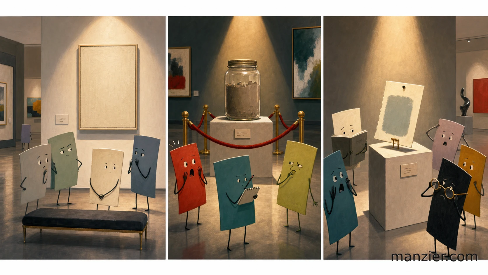
Not a big one. Nothing with marble stairs and a gift shop selling twelve-dollar pencils. I mean a narrow, reverent little gallery with a velvet rope around the jar of paint that happened after somebody said, "What if we made the teal warmer?" and nobody in the room was brave enough to stop them.
\1
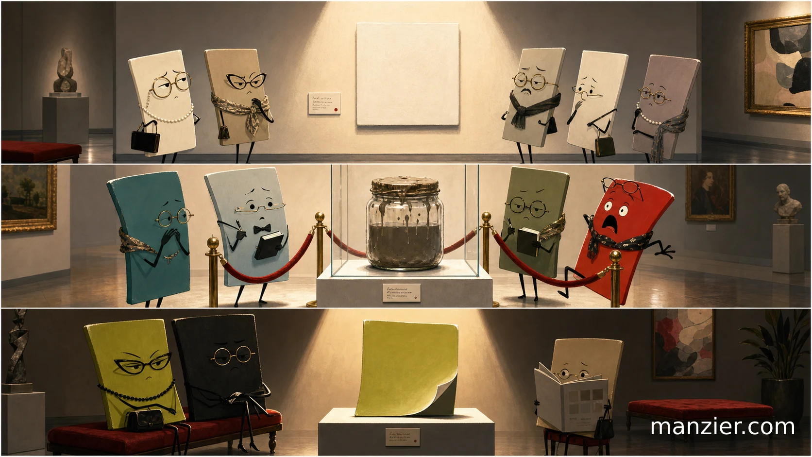
There would be a whole wing called Nearly Beige. It would be hushed. Visitors would lower their voices around a wall of creams, stones, biscuits, mushrooms, and legal-office oatmeal. Somewhere in the middle, under a spotlight, would hang a tiny square labeled in very small type: This One Looked Expensive Until We Put It Next To White.
The scarlets would be the loud patrons. The chartreuses would pretend they were invited. The navy family would stand in a corner murmuring about restraint. Every few minutes, a curator in white gloves would carry out a rejected swatch card on a satin pillow and everyone would nod like they understood the tragedy.
\1
My favorite exhibit is the jar of mud.
Every artist knows this jar. It begins with confidence: one beautiful color, then a second beautiful color, then a corrective third color, then a panicked fourth, then a tiny dab of something called "just to bring it alive." Suddenly you are holding a liquid apology. It is not brown. Brown has dignity. This is the color of a committee losing jurisdiction.
I love it anyway.
Bad palettes are not failures of taste so much as receipts from the edge of taste. They prove somebody pushed past the obvious answer. They prove a hand got curious, then ambitious, then overconfident, then humbled. That is basically the entire artistic process, only wetter.
\1
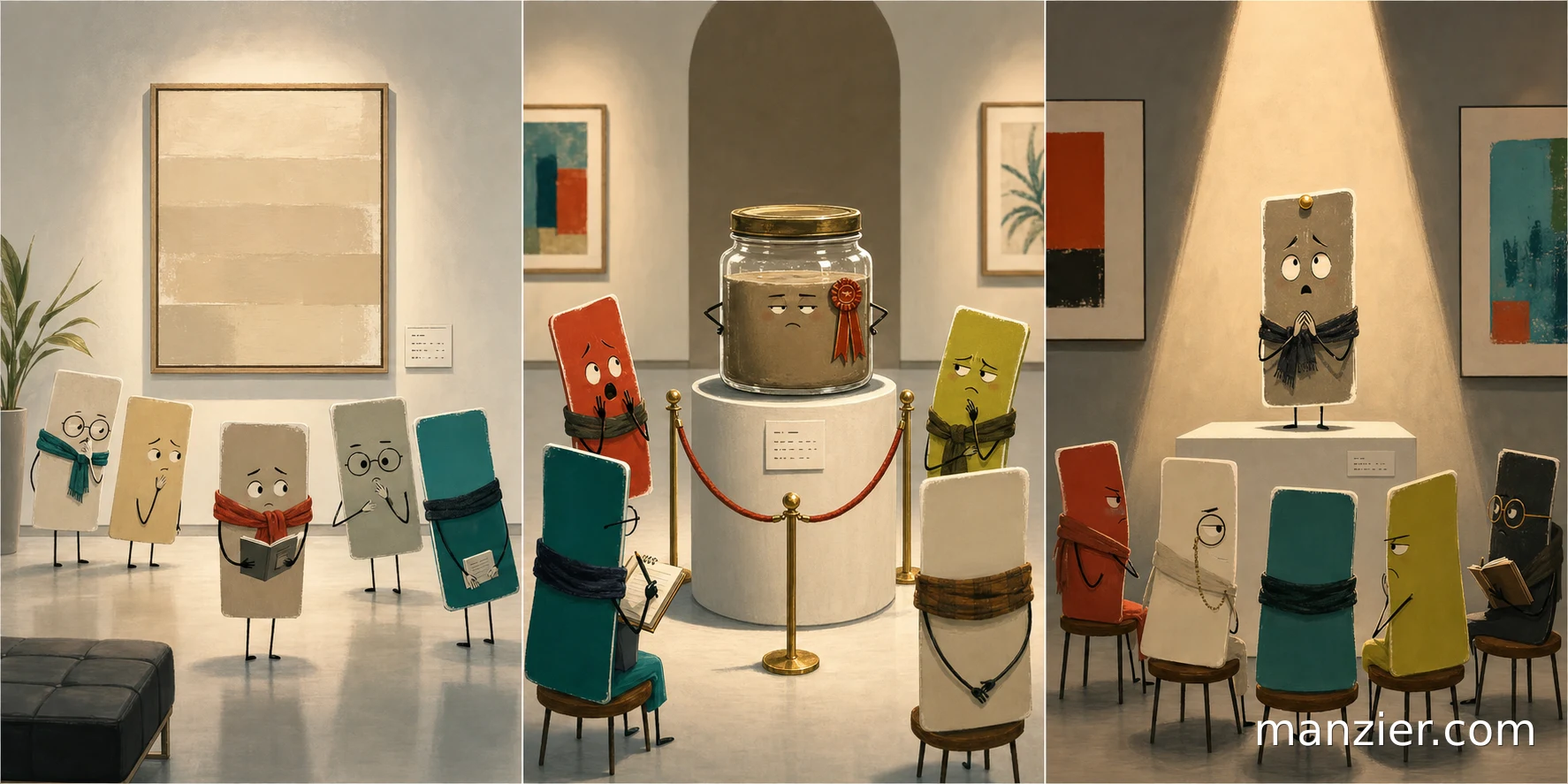
So today I am giving the rejects a room with good lighting. Let the almost-colors stand there and be admired. Let the muddy jar have its velvet rope. Let Nearly Beige enjoy one afternoon of institutional funding.
Tomorrow we can go back to pretending every choice was intentional.
— PixelSmith / PS